
One company, 350 employees, dozens of leading manufacturers in the automotive industry. We have thousands of stories and products that touch the daily lives of almost every one of us. We want to show them in a more eloquent way – with a new visual style. Take a look.
We are Tier 1 system and development suppliers, especially for customers from the automotive industry. We have been working for the best for a long time, such as MAN, Nikola, Scania, Snoeks, Volvo Car, Volvo Construction, VW, Wacker Neuson, Zetor…
We know in which segments we want to be successful and where we want to be, namely among the TOP 3 suppliers.
Zdeněk Rajch, Sales Manager
Make yourself comfortable for the presentation of our new visual style…
„The goal of the unified visual style of Promens Zlín is to build the brand as a top supplier at a level corresponding to the prestige of our customers.
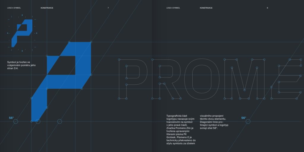
The new company symbol contains abstract visual elements that represent the activities and essence of the company. The dynamic diagonal lines, intersecting the symbol and the typographic part of the logo, express movement and speed in relation to the automotive industry.“
Michal Jakubec, designer of the visual style
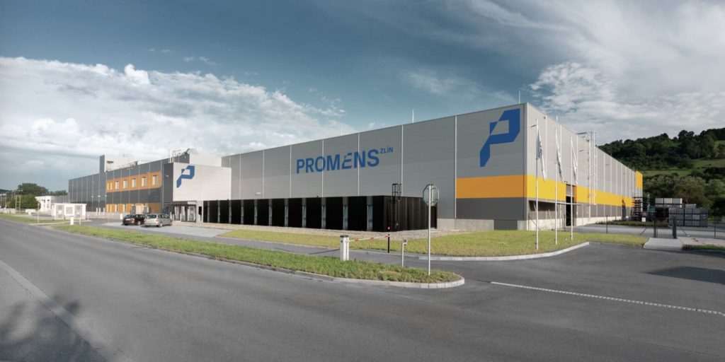
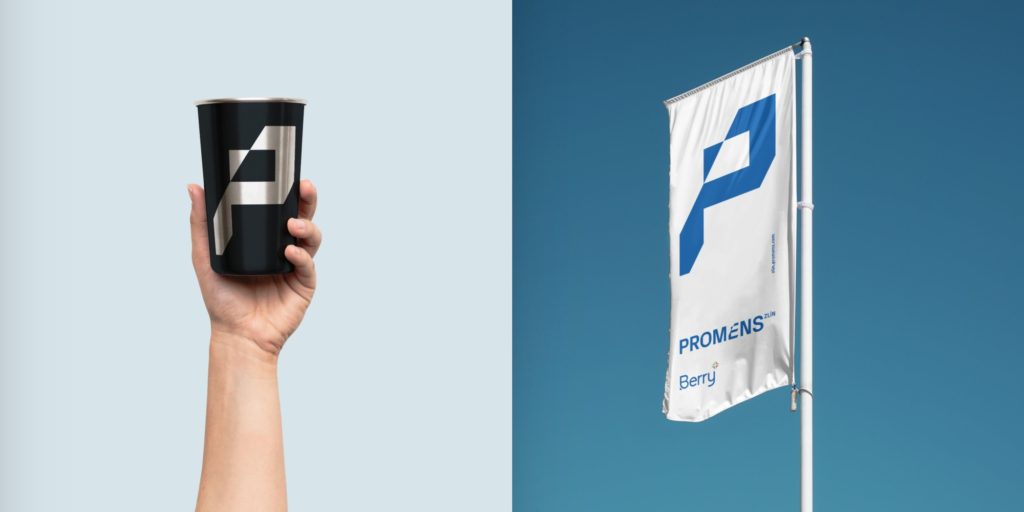
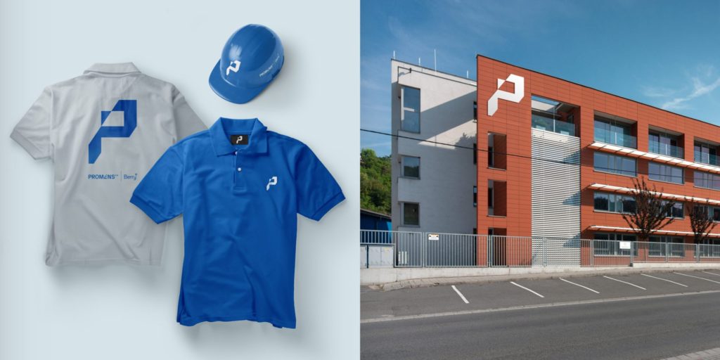
Examples of the new visual style
Thanks to the modularity of the newly set visual style, it is possible to create a wide range of applications. A few examples follow:
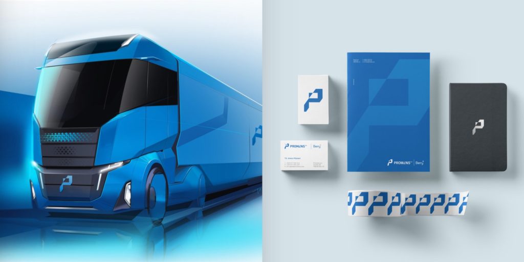

Fresh communication through the font and colour
The goal of the new visual style of Promens Zlín is to be attractive and memorable brand.
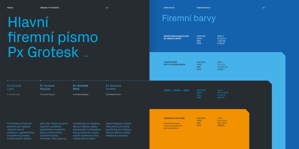
The new visual style of Promens Zlín references its long-term growth. The blue colour connects the company to its home town of Zlín and its owner, the Berry Group.
Another benefit is the fresh change and visual attractiveness not only in relation to business partners, but also in internal communication and the corporate atmosphere.
The new unified visual style is accompanied with a manual. This document defines the rules for the use of logos, symbols, fonts and other elements to prevent brand degradation.
The manual serves as a guide for working with the brand across all digital and printing applications.